A week with Sterling Ink
2024-09-04
It is Hobonichi season! And you know what that means. It means it's time to buy more Hobonichis!
Or... Maybe not.
Recently I came to the conclusion that the Hobonichi Weeks doesn't actually work for me. I wish it did. I spent a few years with the Weeks and had mixed success. I always wished that I could use the horizontal week layout more effectively. My main gripe with it was the fact that the Hobonichi weeks is so narrow. I could never fit everything that I wanted to fit into the tiny space. What I really wanted was an A5 Weeks. Hobonichi is quite stable in their products so I had no hope of that happening any time soon.
Enter Sterling Ink.
I know Sterling Ink through their sticker collections. I'm not a big sticker person, so I kind of dismissed the idea of a sticker company creating planners. Until I actually looked at their offerings. This year, they have an A5 horizontal week planner, with enough pages for a page per day at the back. This is my dream notebook!! I need it, and badly.
But I was unfamiliar with the Sterling Ink format. So. I did what any rational person would do and bought one of their 2024. Yes, I bought a 2024 planner in August 2024. Thankfully, they provide half year books so I got a July-December 2024 planner. They only had the A6 size, but I just wanted to get a feel for the product.
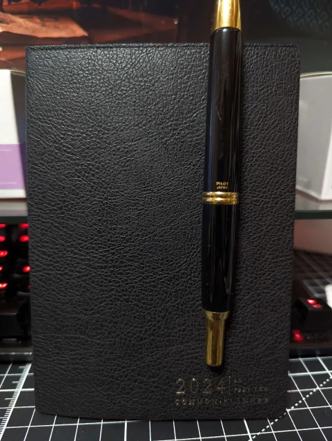
First of all, I loooove the cover. It's a sophisticated, sleek, faux leather cover with minimal branding. It's a bit more in line with the aesthetic that I'm trying to cultivate nowadays as well.
Now, there's a lot about the inside of the planner that I haven't used yet. Such as the quarterly sections and the goal breakdowns. No pictures because I didn't really use them.
Monthlies and Weeklies
Speaking of not using. Or not using effectively. I never really know how to use the monthly and vertical weekly in a beneficial way. I put in my due dates for the courses I'm taking this semester and other random occasions in the monthly.
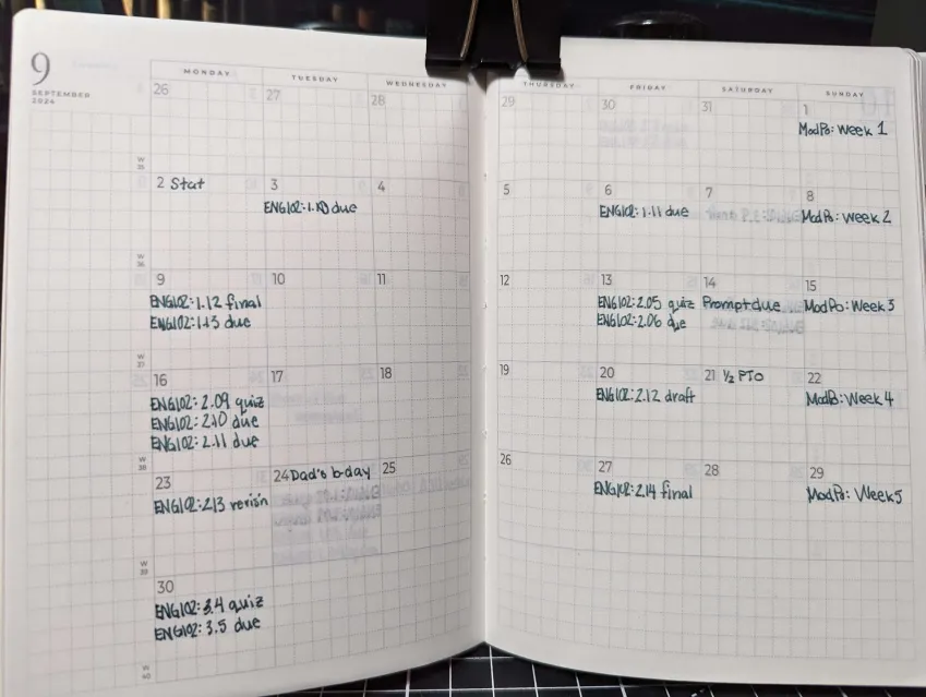
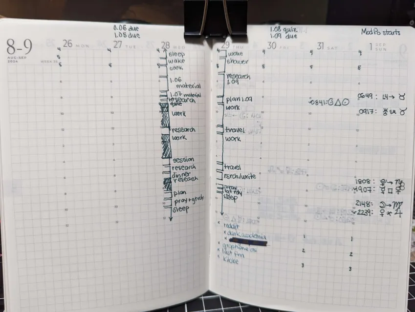
The vertical weekly never works for me. I used to time block in the Cousin but then I would never look at it again. I rely more on my calendar for hour by hour planning. Things change way too often for me to commit to something on paper. And I like how I can easily play around digitally compared to paper.
Towards the end of the week, I wanted to try something new. I wrote in astrological transits and events. But as you will see later, I like to write that information down in my dailies instead.
On Thursday, you can see that I tried writing down my distractions down at the bottom but then quickly abandoned that idea. I am fully aware of my own vices but I don't think this format is the best way to reflect on them.
Dailies
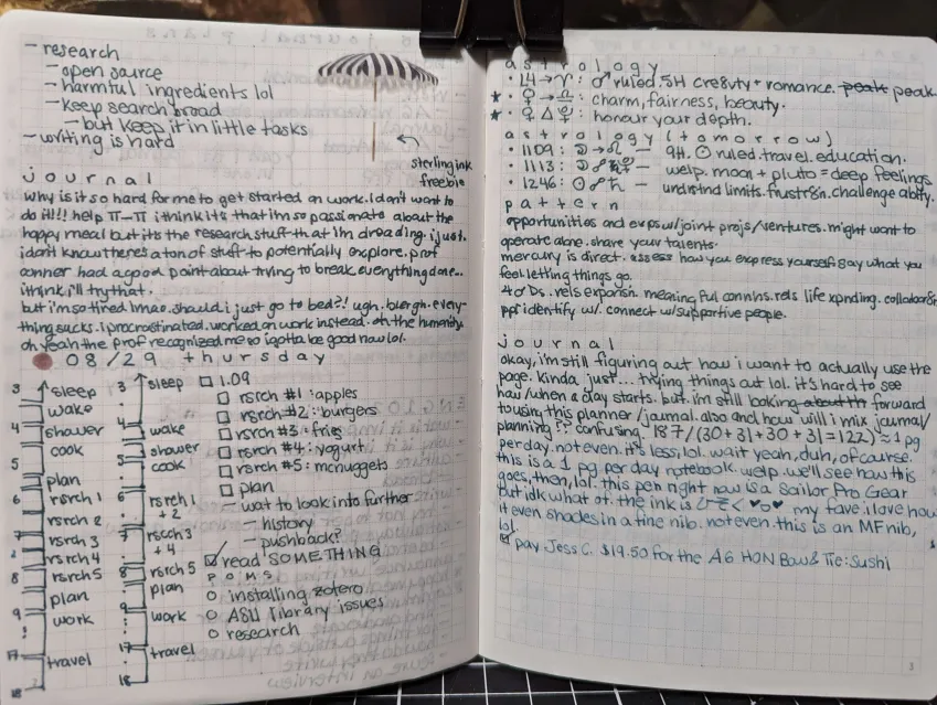
My daily spread is pretty consistent. I used a similar format in memo pages of the Hobonichi Weeks. The only change here is that for every heading you see, I would usually create a new page for it. I'm not sure why I'm trying to conserve pages when I often didn't use that many pages in the Hobonichi Weeks. So far I'm using around 3 pages per day. But also keep in mind that the A6 is quite small.
I did mention in the previous section that I don't like putting my time blocking on paper. However, I do this every morning to get an idea of what my day is like. The specific times don't matter too much.
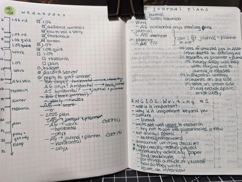
The next page is a continuation of Wednesday and onto Thursday. I was playing around with the headings of each day because I wasn't sure how to make it stand out. I also do a little bit of journaling as well.
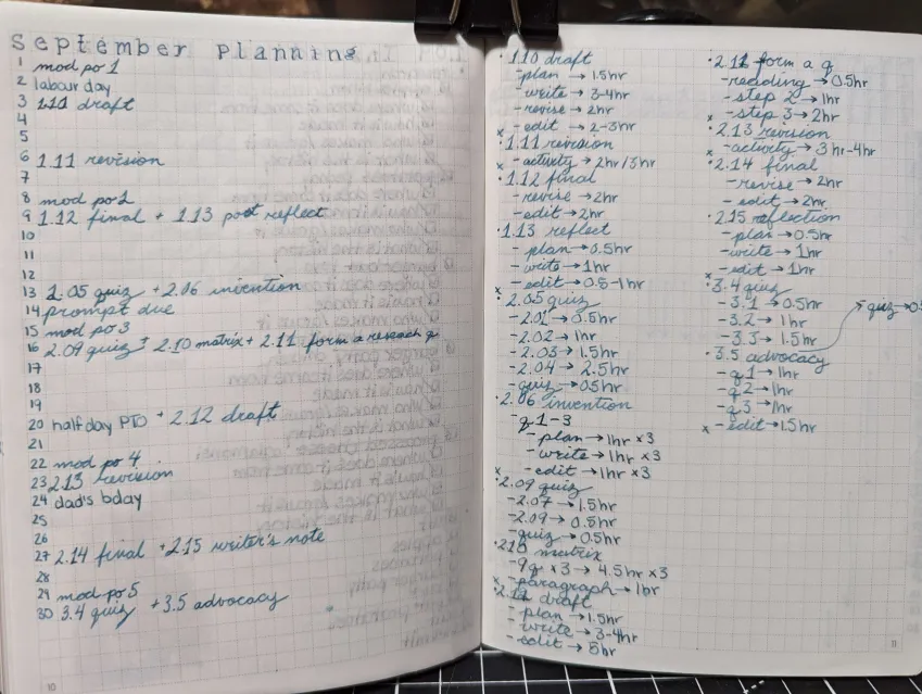
These next two pages are me trying to plan out September. I get pretty granular. For each item that's due, I try to estimate how long it will take me to accomplish that task. I even try to break down tasks to smaller tasks. I am pretty accurate when it comes to reading assignments but writing assignments, I tend to feel like I overestimate but often end up not estimating enough.
You can also see that I started writing in cursive. I feel like it just looks nicer.
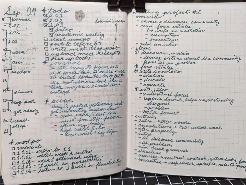
Still trying to play around with headings. I like the little sparkle emoji and tried to replicate it. But I think it doesn't stand out quite enough for me. You can even see me meta-journaling about bullet points vs. check-boxes.
And on the other page, you can see me write out the criteria and steps for my next assignment.
How I feel about Sterling Ink so far
The paper is nice but I am noticing how much ghosting and bleedthrough there is with my pen and ink of choice (Platinum Century 3776 EF with DeAtramentis Document Ink Fog Grey). I suspect it's mostly the ink, because the lighter blue writing looks great (Kyo no Oto: Hisoku with a Sailor Pro Gear F nib).
I was worried about the unstructured blank pages at the end. But I never really had a problem with in it the weeks. I am missing the amount of page space compared to the Weeks. The Sterling Ink grid is 35x24 squares and each square is 3.7x3.9mm. The Weeks is 49x23 with 3.7x3.7mm but somehow each individual square feels smaller. That 0.2mm makes a difference, somehow. That being said, this is the A6 size which is obviously smaller than the N2 Weeks size.
All of my thoughts about the vertical weekly are my same thoughts about the Cousin weekly pages. I just cannot make it work. The structure makes me want to use it that way it's intended. Any dense writing in the small columns are a no go for me. I'm so excited for the horizontal weekly layout.
Either way, I'm quite happy with the book so far! After this little trial run, I have made the decision to buy Sterling Ink for 2025 but that's for a different post.
